Grey Poupon
Branding, Packaging, Illustration, Print
Adobe Illustrator, Adobe InDesign, Adobe Photoshop, After Effects

The Brief
Refresh Grey Poupon’s brand identity to make affluent millennials crave its classic French expertise and quality.
The Solution
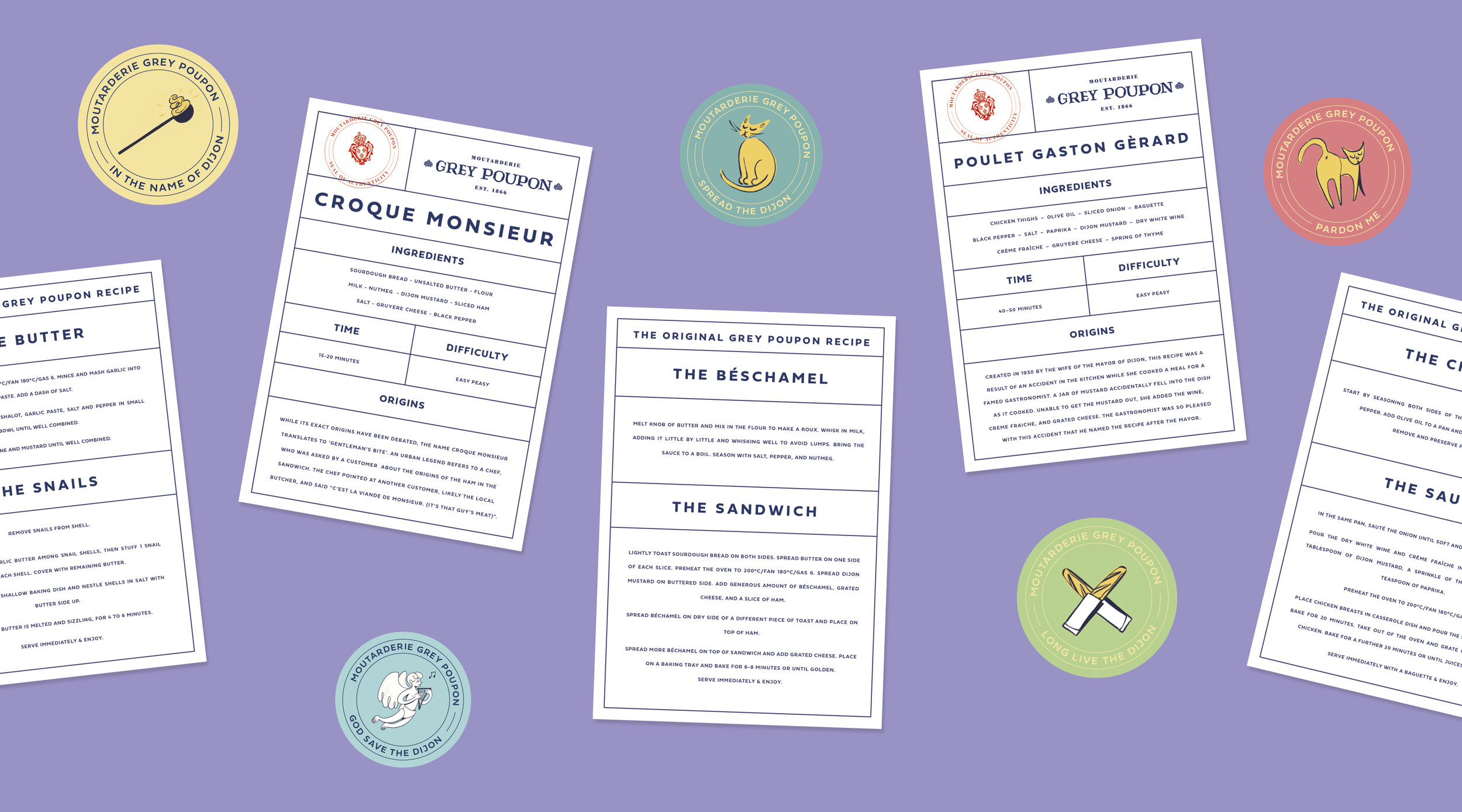
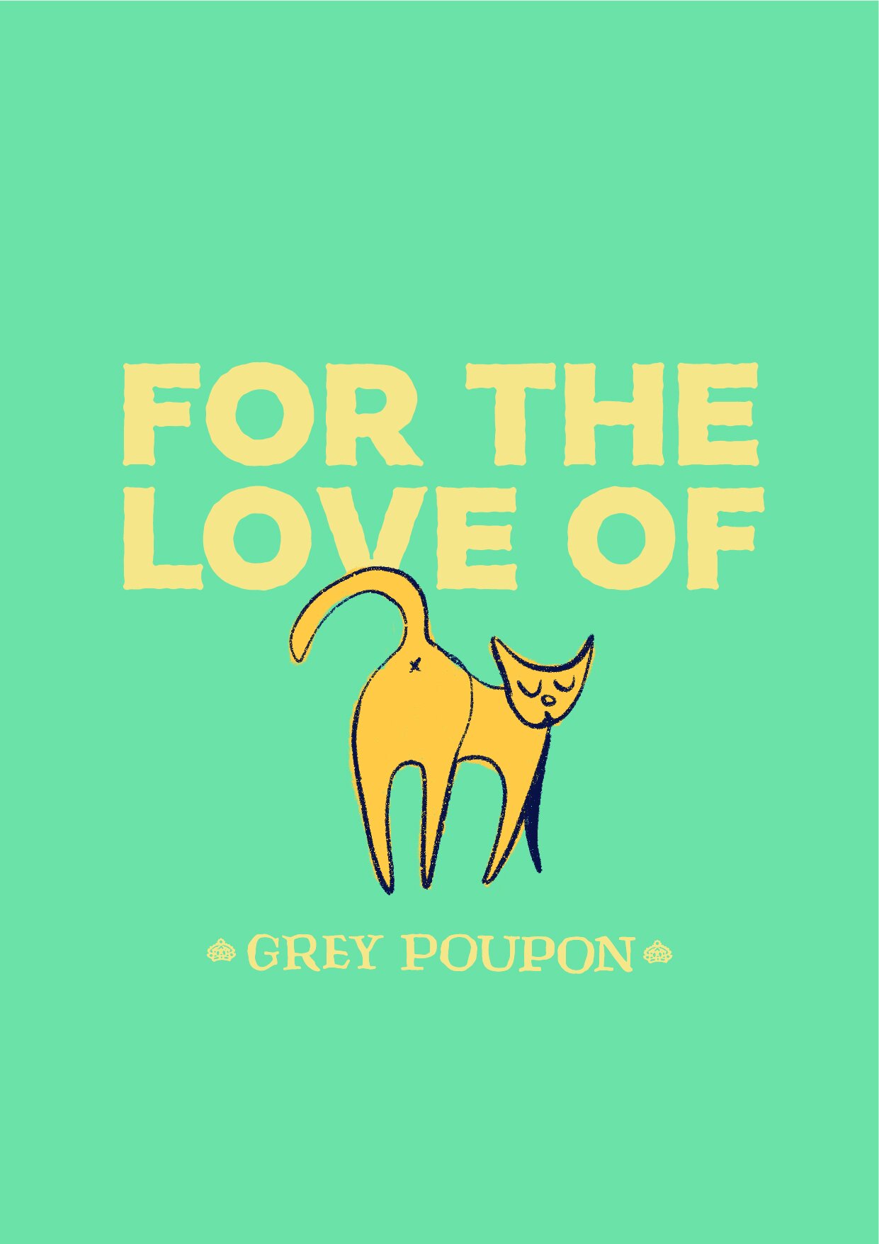
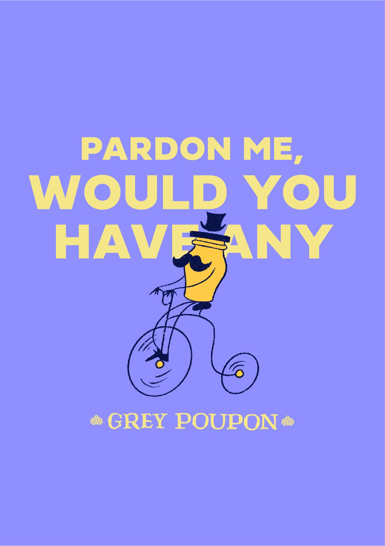
My approach was to bring together playful wit with traditional French craft, poking fun at the ‘Pardon Me’ days. Millennials are interested in the story of a brand. They want to know they can trust a brand by connecting to its origin.
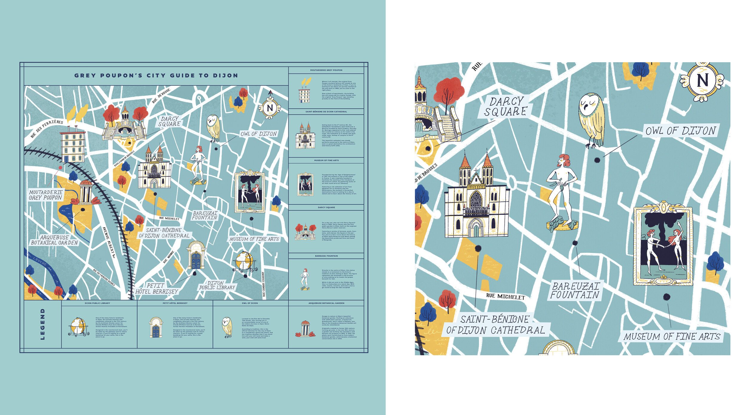
Touching on Grey Poupon’s relationship to France’s culinary history, as well as its cultural relationship to the city of Dijon, this refresh communicates Grey Poupon’s staying power as a purveyor of excellently crafted Dijon mustard.
In engaging the audience with a limited edition ‘Box of Delights’, consumers can connect to Grey Poupon and engage with France’s culinary traditions. All of which would be facilitated by Grey Poupon’s classic Dijon mustard.

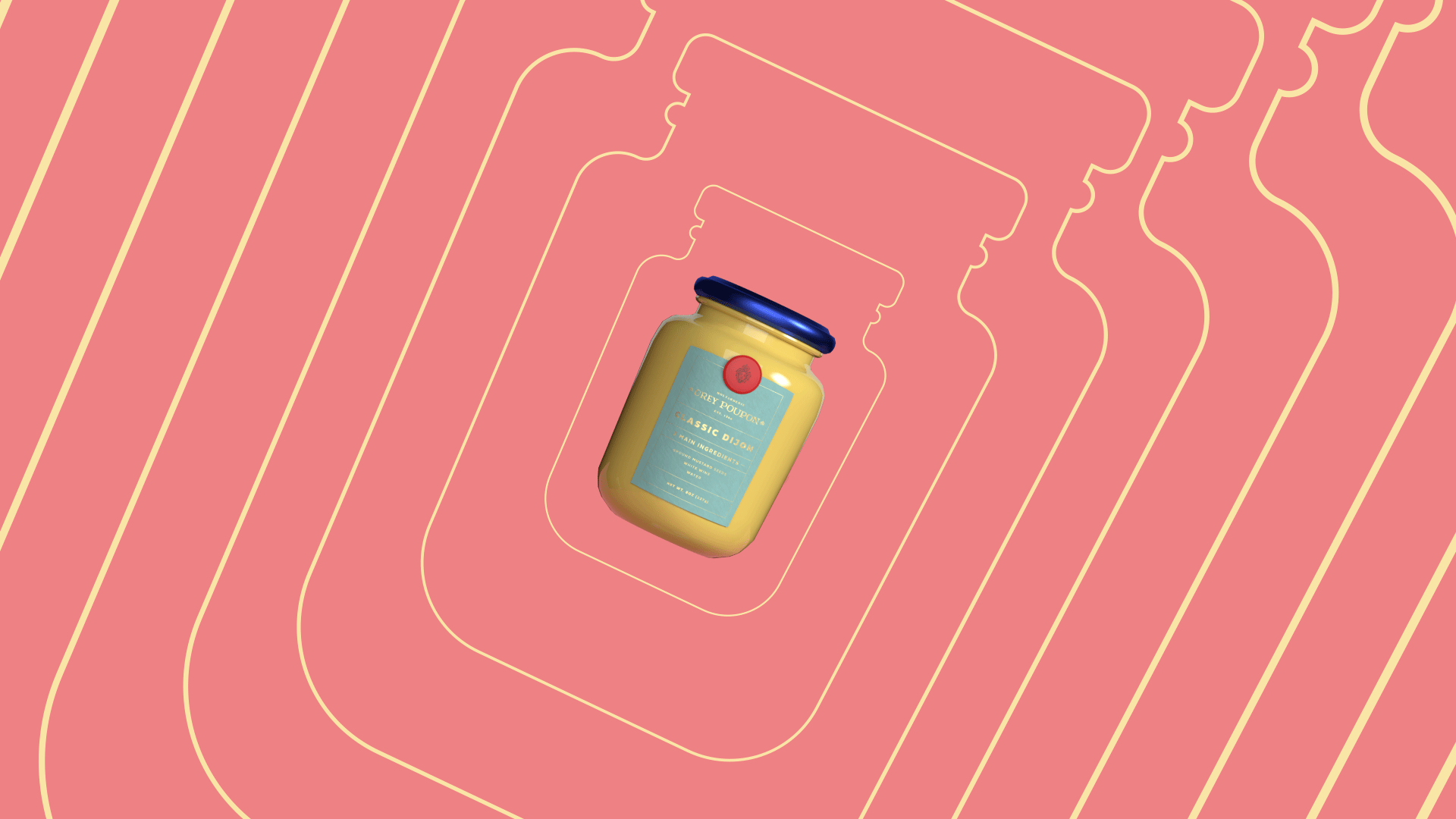
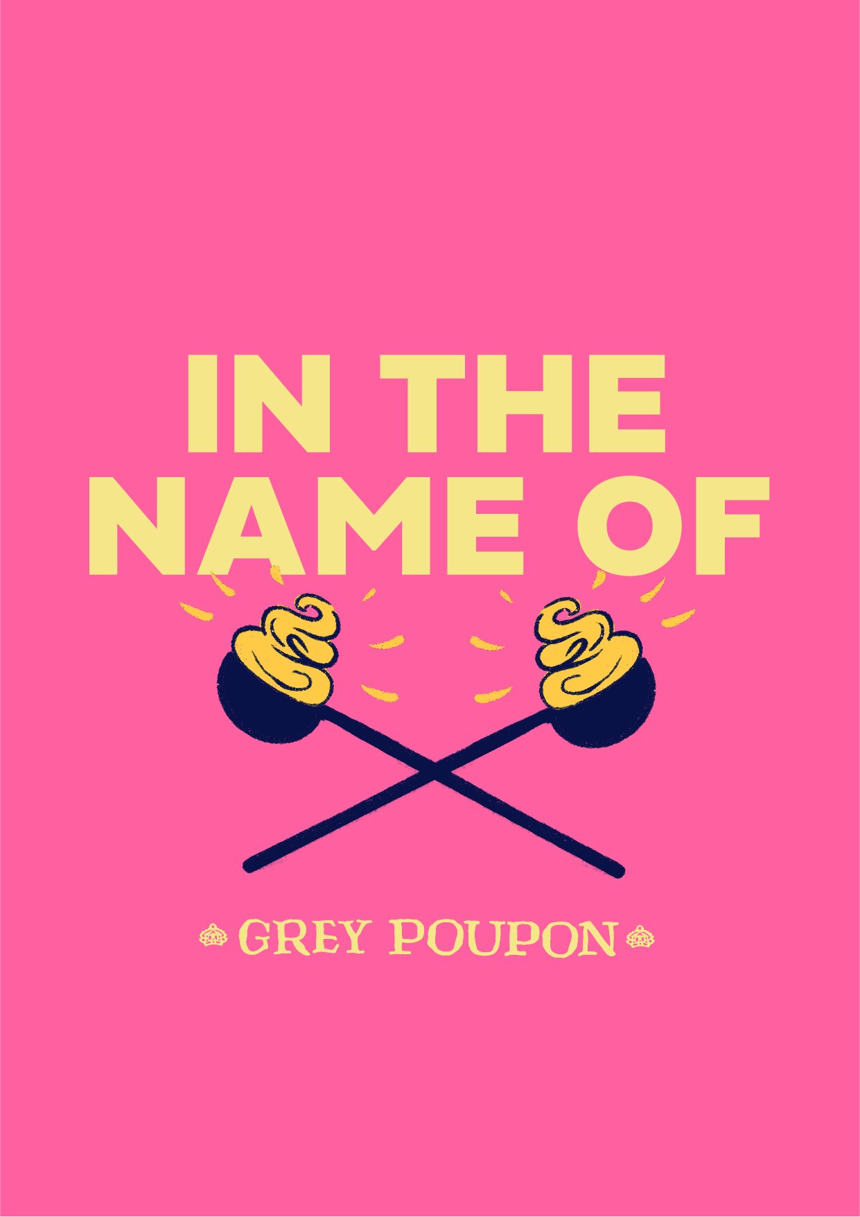
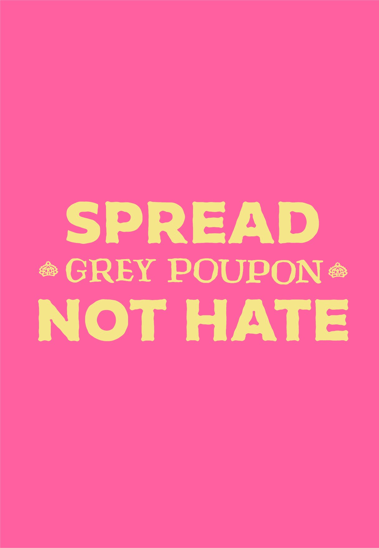
Luxury, but with a little attitude.
Heritage and youth are two contradictory concepts. One speaks of tradition, the other of breaking the mould.
How do you put these two concepts together to make something that is both youthful and playful yet
seeped in history and luxury?
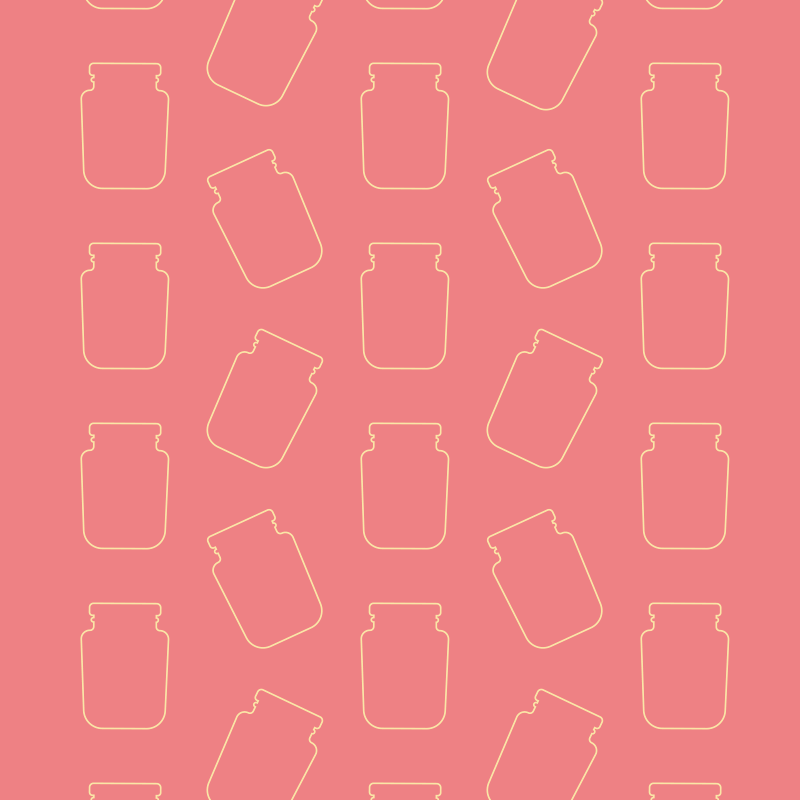
By reducing the overall busy-ness of the composition, we communicate confidence. Less is more in this case, and in using bold sans-serif typography, punchy pastel colours, and a suite of buoyant illustrations, it creates an interesting and engaging mix of elements. Ensuring Grey Poupon can stand out from the crowd as a brand of mustard that is both self-aware and connected to its audience.


Before

After